TEDx Potenza #beautifullyugly
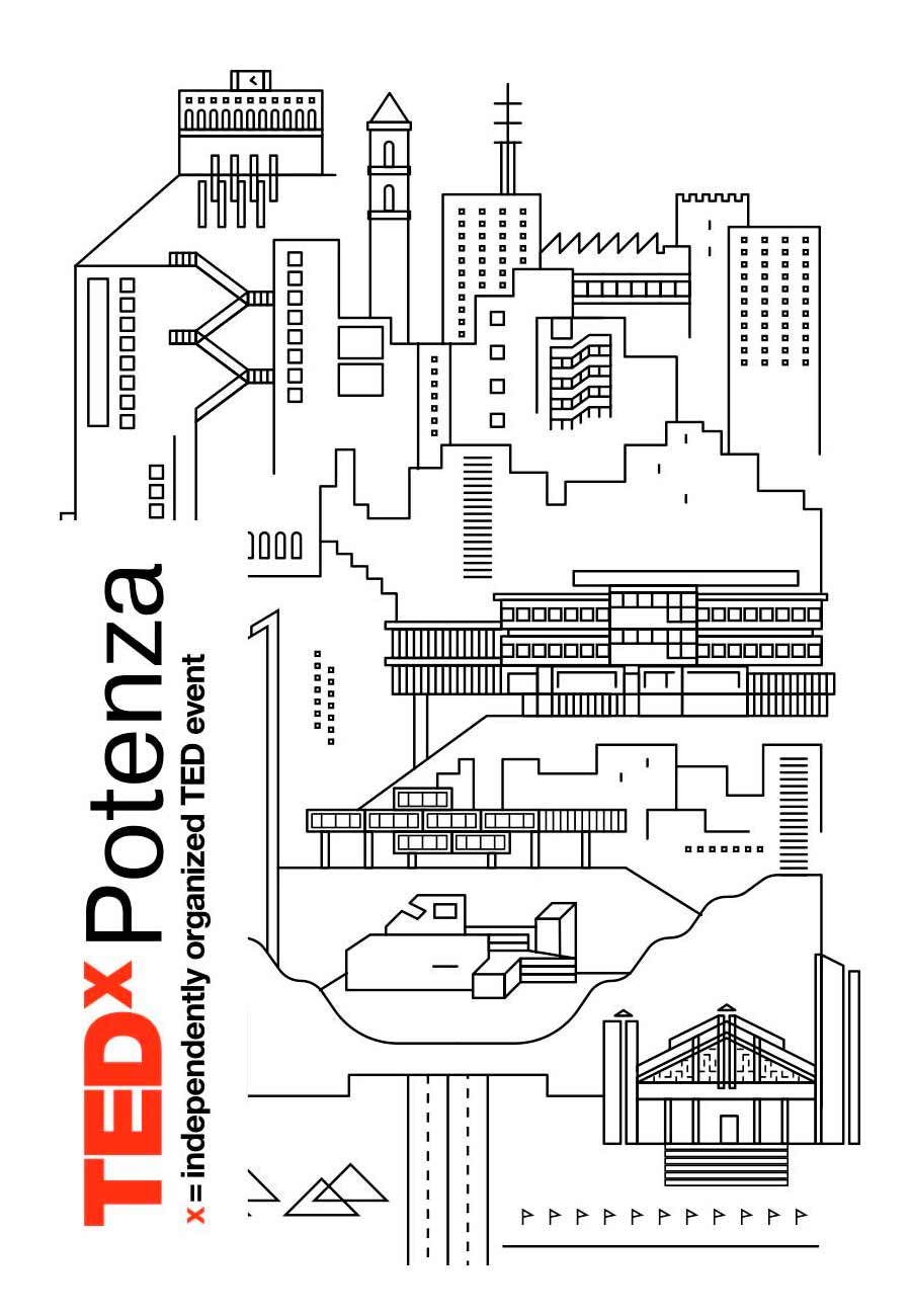
Potenza is usually considered a term of comparison for ugliness, in Italy. This is because a massive amount of concrete was used to build the houses, in order to protect them from earthquakes. The event was created just get over this cliché and make its citizens realise that there’s much more to it.
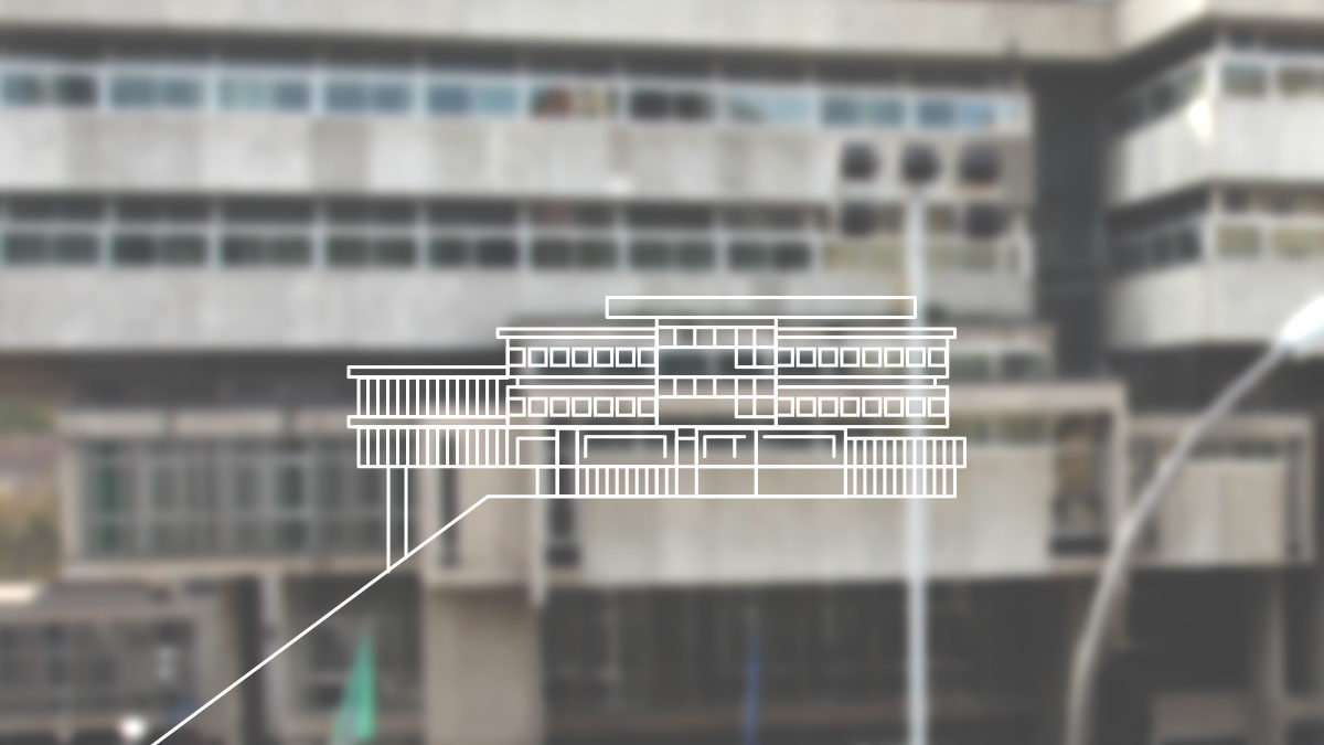
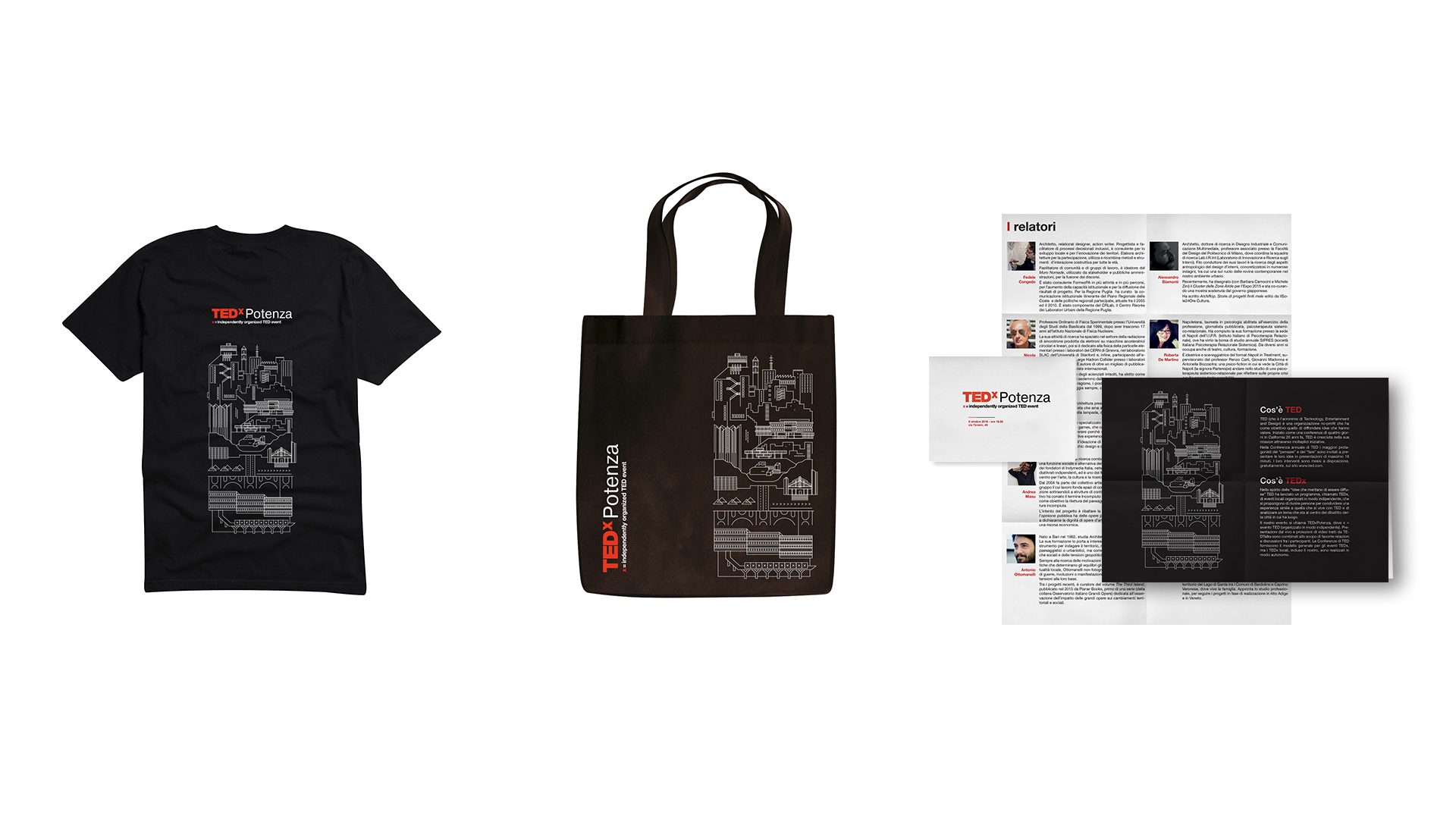
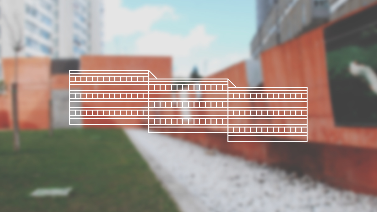
The visual identity is a tribute to some of the icon buildings of the city, with the intention of making them graphically uniform and modular. This way each drawing can keep its dignity as individual while also being able to join the others, in order to create unique configurations and represent the city in a personalised way.
TEDx Potenza Ponti e Passaggi
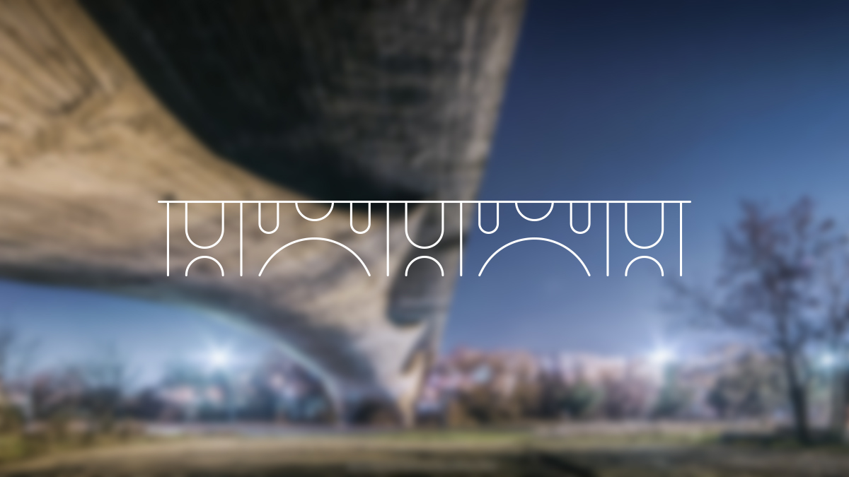
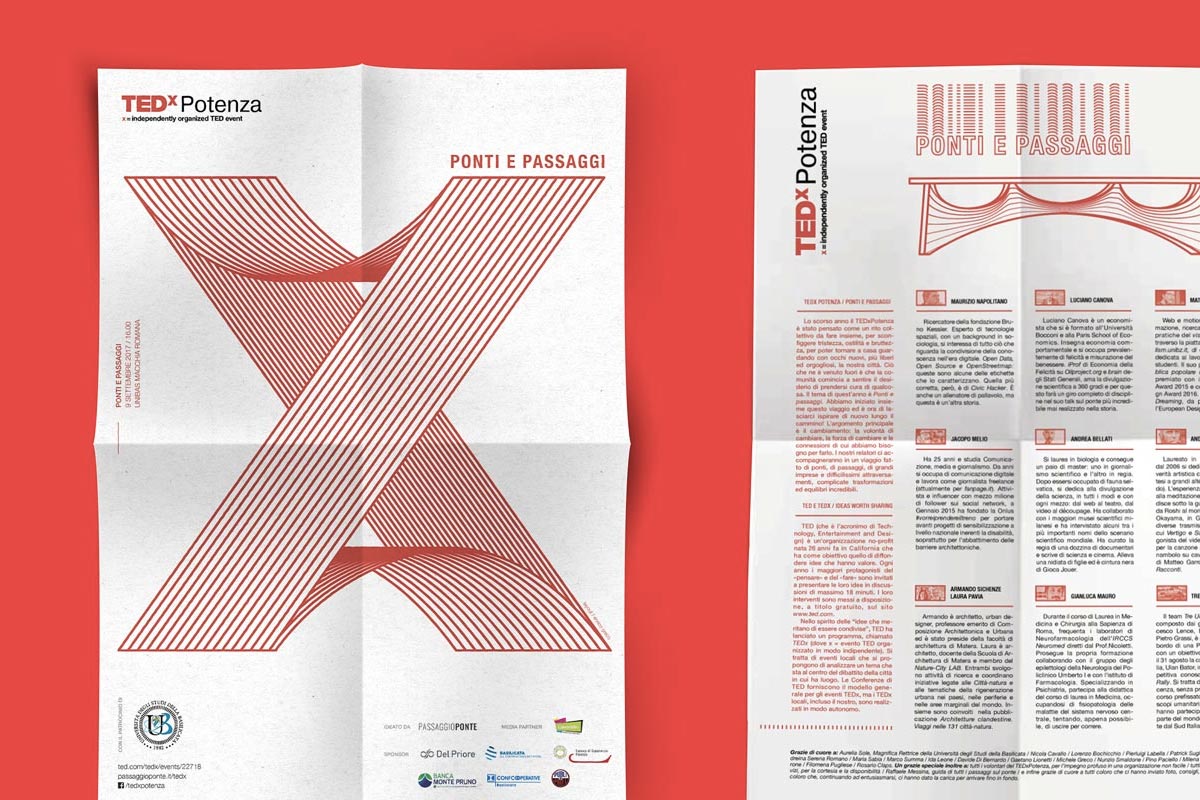
“Ponti e passaggi” (bridges and openings) is the theme of the second edition of the TEDx Potenza talk. The event has the goal to increase awareness on the precarious conditions of the Musmeci bridge, a truly unique architectural and engineering masterpiece, usually referred to as a symbol of the city.
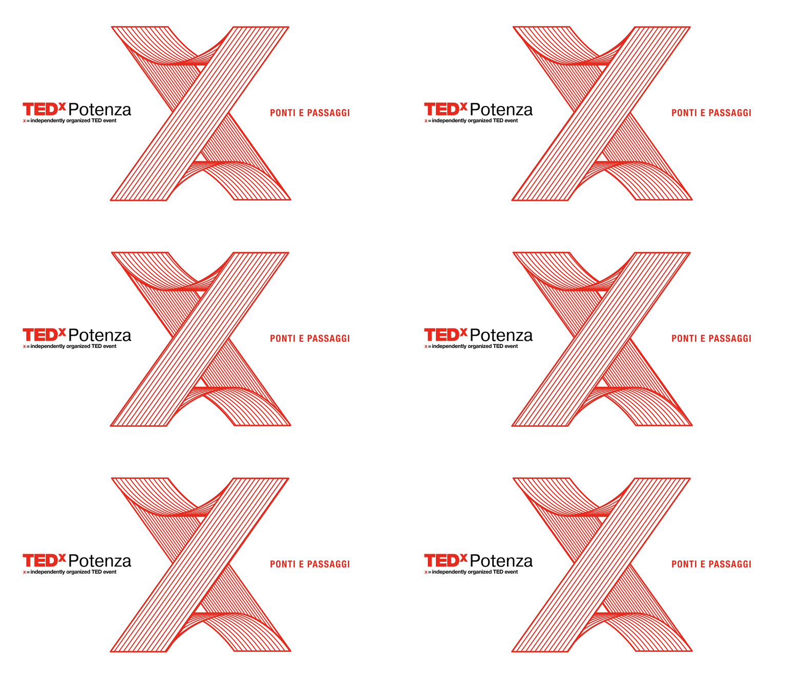
The brand identity is a full hommage to this monument. The event logo represents an “X” that bends just like the bridge, and it’s supported by several animated illustrations that depict this masterpiece from every angle.

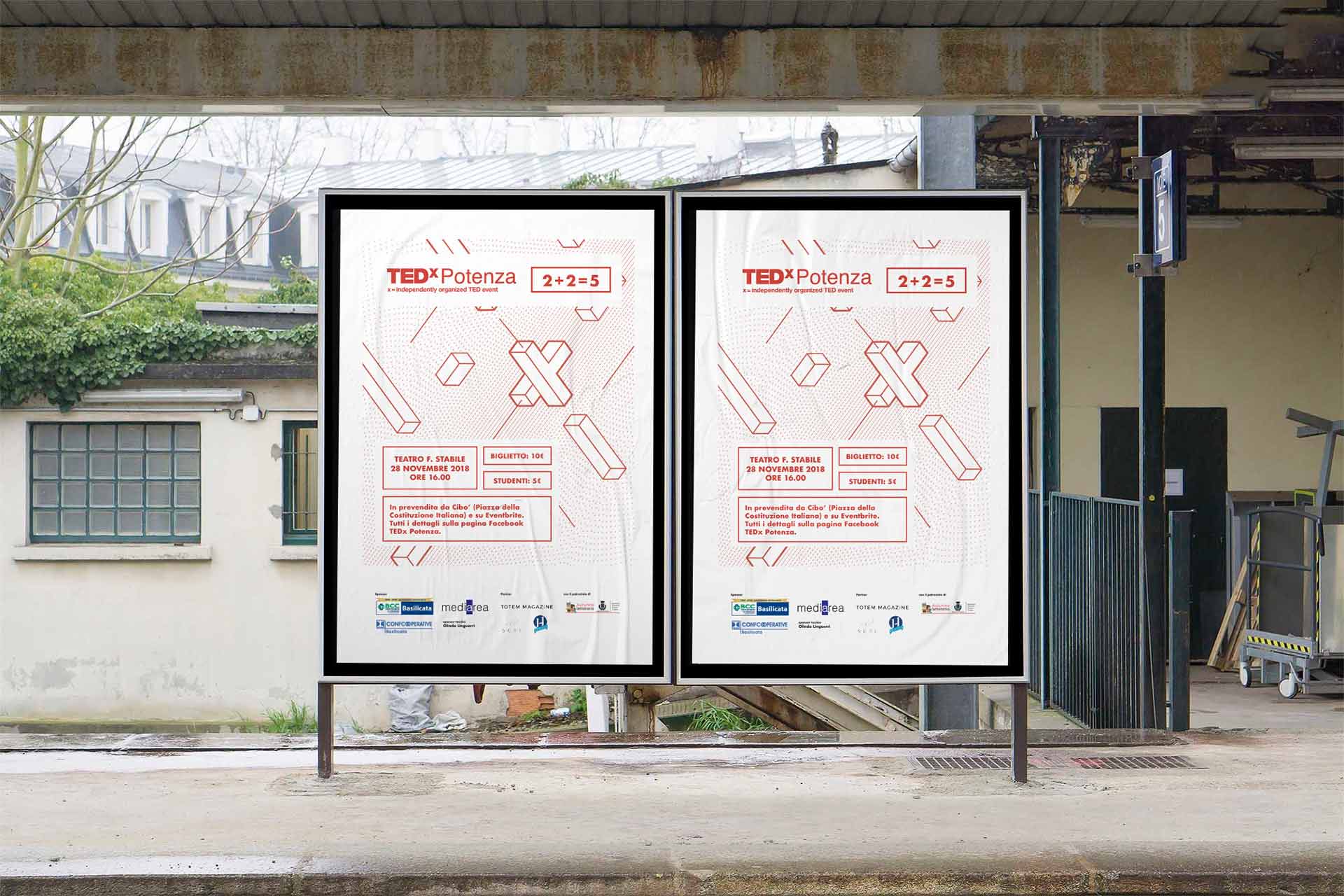
TEDx Potenza 2+2=5
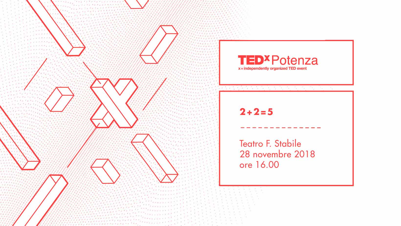
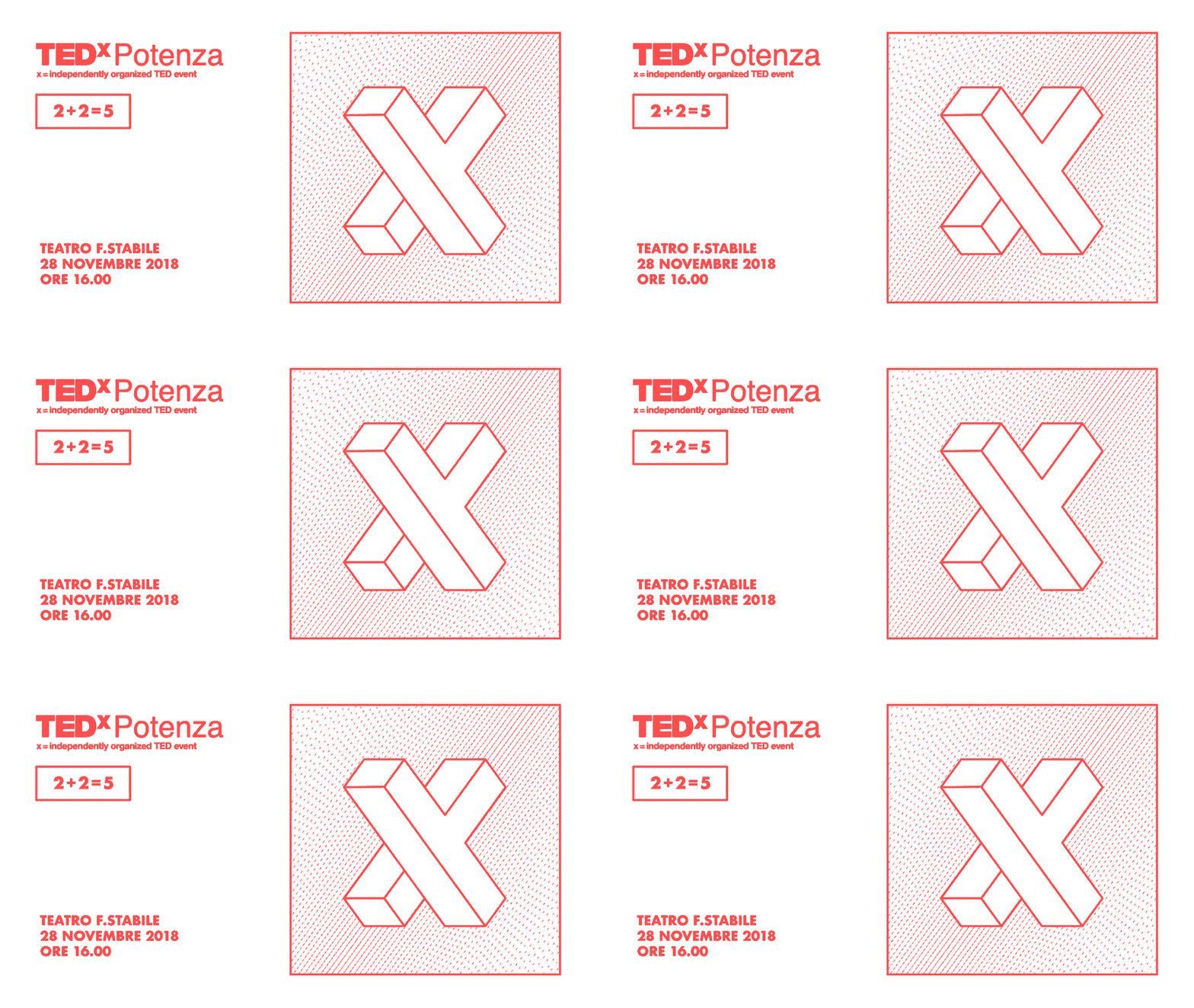
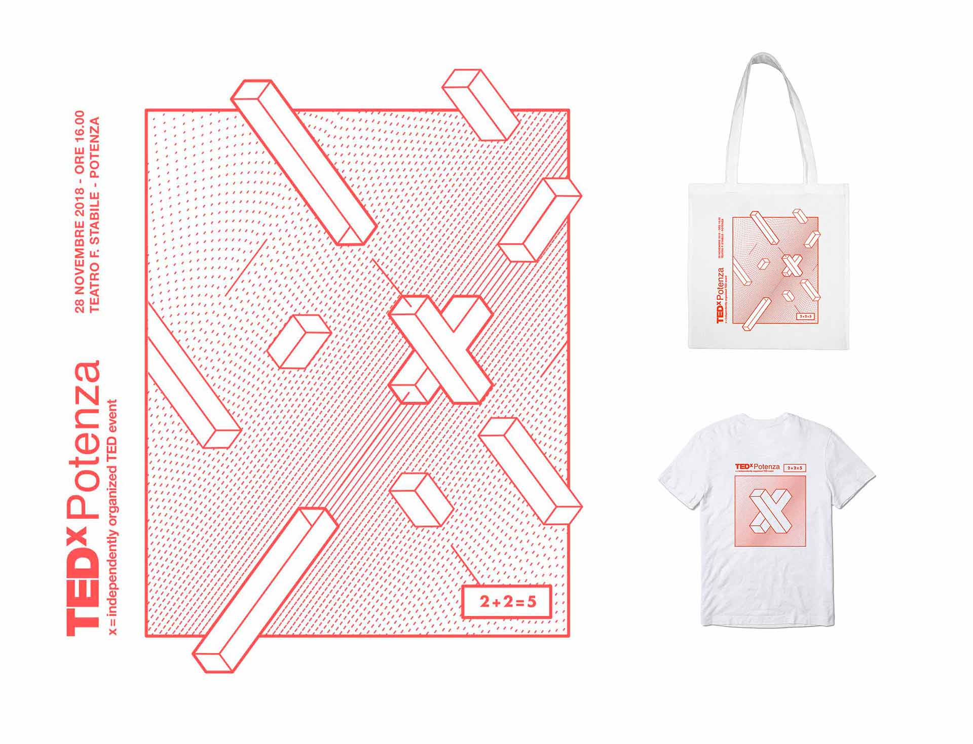
The theme of the third edition is “2+2=5”. The name quotes the infamous mathematical falsehood that George Orwell presented in 1984 as a symbol of political manupulation, but with the intention of giving it a new meaning: if we cooperate and share good energies for a common goal, then the result has an added value, so 2 and 2 make up 5.
The brand identity plays with the concept of team by using Lego-shaped items, with one of them representing an “X”, symbol of the TEDx. Since the event aimed to coordinate a conversation, I wanted to give an instruction booklet vibe to the visual by letting the items float in space and by connecting them with lines.
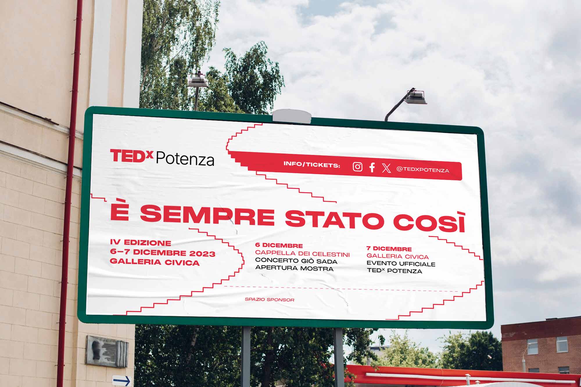
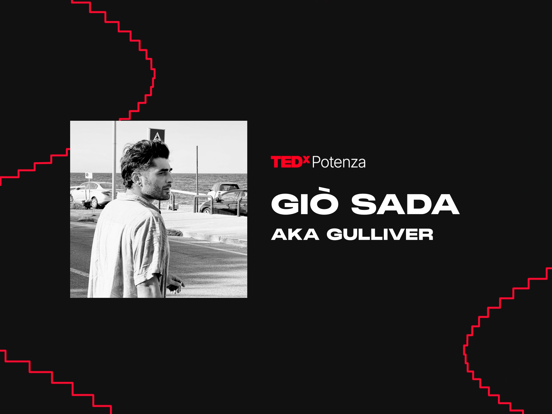
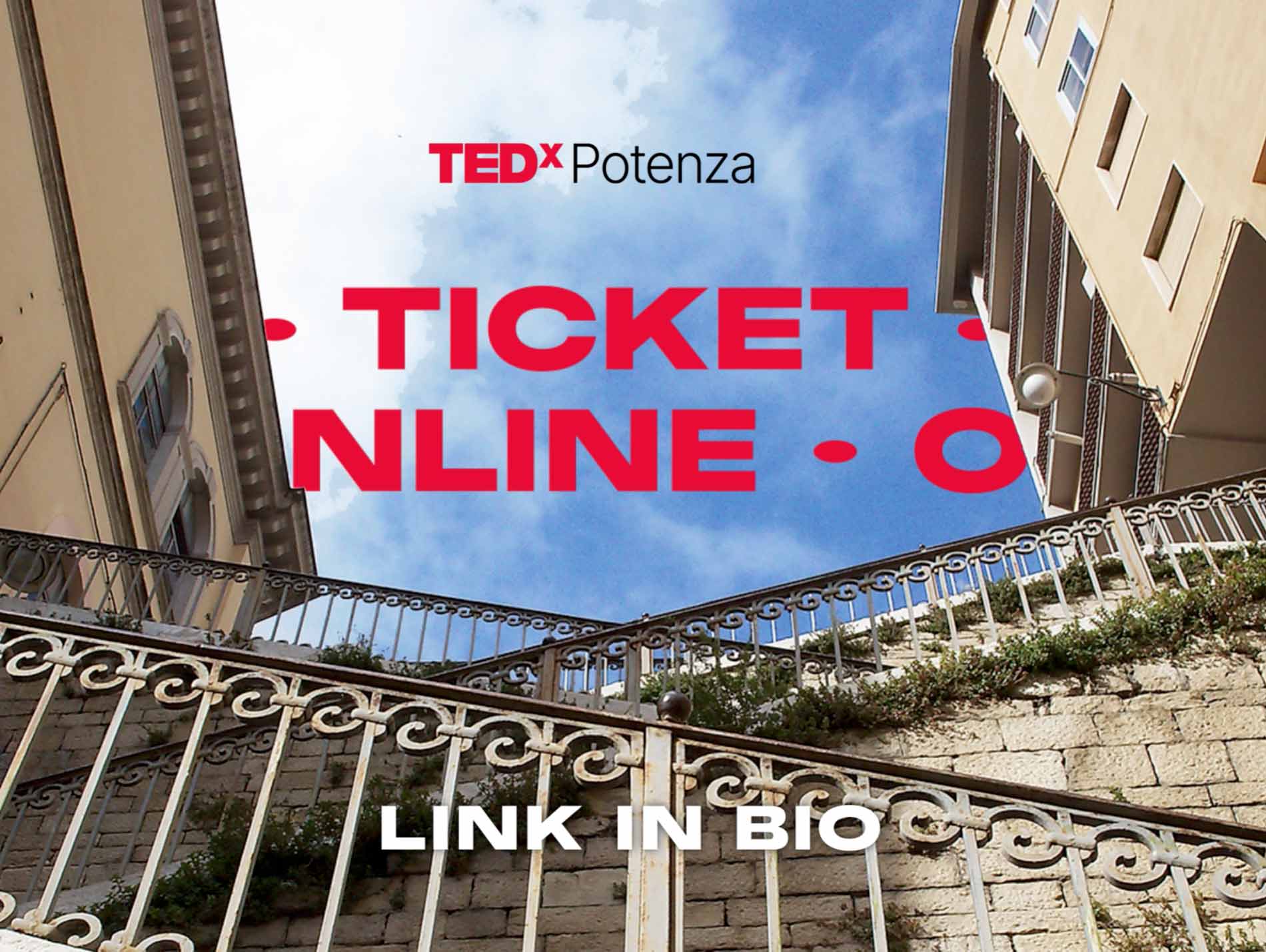
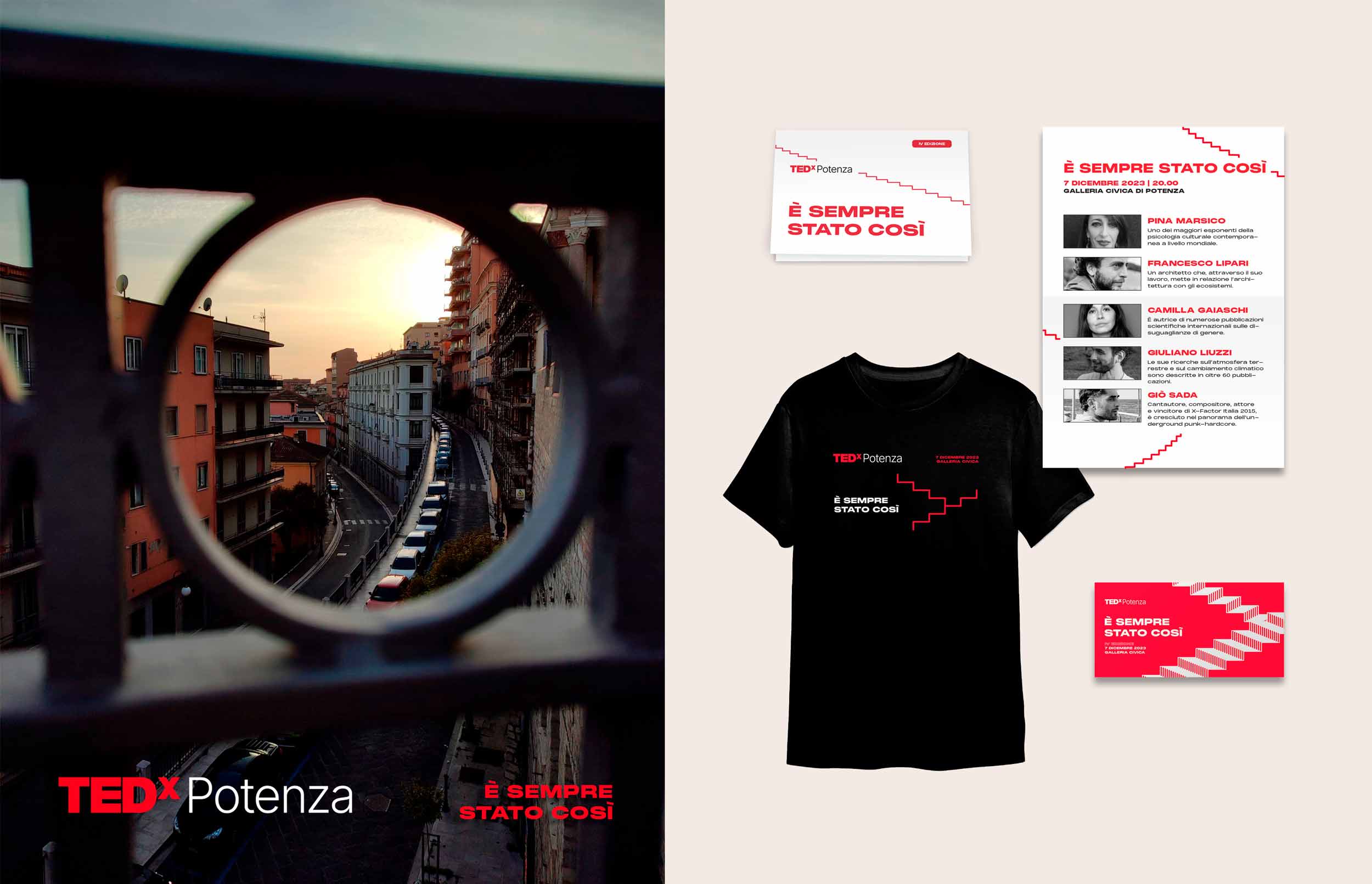
TEDx Potenza È sempre stato così
“È sempre stato così”, meaning “It’s always been like that”, is not only the theme of the fourth edition of TEDx Potenza, it’s also the state of mind of the people who refuse to accept any change in the name of tradition.
The visual identity represents all this by using the main symbol of the city: an escalator that seems to take anywhere. Potenza has in fact the longest escalator system in Europe and it’s second worldwide, following only Japan.
